Affordable Art Fair 2021
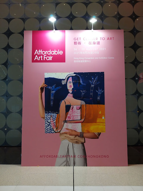
I got lucky and got free tickets to the affordable art fair. It was all thanks to John McArthur from Spitting Gecko Studio . If you would like to join some weekend figure drawing sessions, he is the man to contact.
I couldn't remember the last time I went to the affordable art fair. I think it either happened in Central, or some place else...It may also have been cancelled because of Covid.
The quality of the artwork was quite varied ranging from somewhat amateurish to very high quality artwork. Considering that most pieces were below 100,000 HKD nothing seemed to go below 1000 HKD. Strangely some of the weaker looking pieces had enormous price tags when compared to some of the stronger pieces. Of course you can say that art is subjective, but at the same time you want to make sure you are getting something of quality, at least in terms of concept, composition, materials, size etc. Especially when a lot of these artworks were two dimensional pieces of art, that were more decorative and illustrative than your usual Art Basel contenders, you would at least expect good craftsmanship and technical skills. With this being said, I was unable to pull out my wallet for most of these prices. I also don't have the wall space in my room to do any of these art works any justice.
These creepy little fairy things were strangely appealing to me. At first the painting seemed to be your usual hyper realistic flower painting, and then you are gifted with these little guys.
I thought the red ones hurt my eyes a little bit when compared to the gold ones. These ones also looked like they spurted out from a pool of blood.
The photo is probably not doing the piece above any justice, but when you stand in front of it there is a crisp, clean vibe that you get from it. I thought the composition was well balanced and the size was pretty decent.
I thought the Sanrio collaboration shown above was a little out of place. I would have expected to see this type of graphic art in a more design art fair, but it was still a very cute and pleasant space. It was very popular with the ladies.
I really like this type of grid form presentation. It's nice way to present all of your smaller pieces as a whole collection. The miniature illustrations were very sweet, and it reflected with me and my interest in illustrating toys and nostalgic objects. The artist was also very approachable and she shared a lot of interesting creative information with me. It was a pity because she didn't consider herself as an artist, and she wanted to be associated with being more of a teacher of digital illustration and graphic design. She does have the technical skills to go beyond just corporate design.
You can follow her here on her Instagram account.
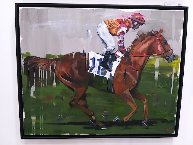
This artist could really paint horses. The horse portrait down below was one of my favorite paintings of the fair. The paint strokes were so crisp and if you get close to the painting you could see a variety of color tones and shades that really gave the painting a sense of depth. I really liked how he kept some areas very sketchy and some places very carefully manipulated.
These posters really hit me hard. They were very associable, but at the same time very sad.
Here is another artist that I was able to share information with. Ticko Liu. He was very friendly and outgoing. He was very passionate, and I really wanted his studio space. He had an interesting style where he merged an abstract and expressionistic painting style with a nice blend of illustrative elements that gave his artwork a sense of narrative.
I kind of really wanted the painting of the village above. 8800 Honkies were a fair price to pay. My wallet never left my pocket. For shame. I would cry if someone else fetched this piece and resells it for a million.
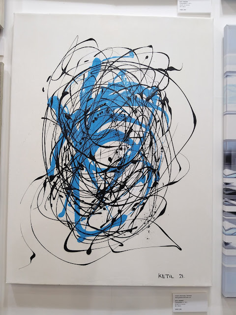
The abstract one above was also another one of my favorites. It kind of had a Cy Twomby vibe because of its use of strong pencil lines and empty space, with crowded areas of various paint marks.
I know a friend who would have liked these container ship paintings. At first I though it was a photograph that was manipulated, but its just another well executed painting.
This painting above is actually really huge. If you stand in front of it, it has a great energy to it. It reminded me a little bit of a late Monet painting of his water lilies because of its ample use of greens. I honestly find greens very difficult to use.
I almost liked this sketchy piece very much. If it weren't for the pinkish background I would have thought it was fantastic. I really don't know know the reason why the pink bothers me.
I wasn't a huge fan of these hyper crisp, graffiti culture, media influenced paintings, but I really liked looking at the one above up close. You can see the various layers of paint that were applied. There is a discrepancy between the layers most probably because of the tapping that was applied to the surface of the paints. The taped areas would get less paint applied to it.
The piece above was really graphic and interesting. They could have easily screen printed this, but for some reason they decided to paint it. Much dedication indeed.
The Hermes inclusion was a bit too much for me, but I like myself a classic Godzilla illustration.
I'm usually not a big fan of traditional Asian ink paintings but this set of paintings felt very refreshing and contemporary. It actually really made me consider picking up traditional ink painting.
This was such an interesting and playful piece. If you live in Hong Kong long enough you will recognize the reference almost immediately. J*****e H***e
I really enjoyed looking at these great blue paint strokes. They were so gestural, but also at the same time very calculated and confident. The transparency of the paint strokes and the subtle overlapping's give it a sense that the artist didn't do each painting in one sitting.
I've been see a lot of David Shrigley's artworks appearing around Hong Kong. Either I was never really paying much attention to his artwork or he has been getting pretty hot in the Asian art market. None the less I really like his illustrative style and playful use of graphic text.
I recognized these paintings instantly because I was never able to forget them when I saw them a few years back in Korea. These paintings are pure eye candy, and the sculptural element just dares you to touch it.









Comments
Post a Comment